Brand Perception Using Spotify and NLP
I remember being a kid and thinking it was pretty funny that the law could refer to corporations as “persons”. I recently had that thought again and it made me think, if a corporation can be a person, then why can’t a person be a corporation? Shortly thereafter I relinquished my humanity.
Dav Corp.
So here I am, David Lopez, the corporation. In order to see how Dav Corp. is doing, I’d like to understand how “cool” our brand is. Though seemingly juvenile, the implications that coolness can have on a brand can be the difference between Nike and Sketchers. In an article published by Warren (2019) brand coolness was conceptualized to have 10 distinct criteria.
A cool brand is:
- Extraordinary/Useful
- High Status
- Aesthetically Appealing
- Rebellious
- Original
- Authentic
- Subcultural
- Popular
- Iconic
- Energetic
Surely Dav Corp. could fit the bill. To see how we measure up, we chose to evaluate ourselves based on data provided by Spotify, and lyric data from Genius. Music can tell a lot about an individual (in this case: a corporation). In many ways, music is a reflection of our personalities, so what better way to measure our perceived coolness than with Spotify listening trends? Here at Dav Corp., we always strive for success, so we can’t just be cool. We must be COOL-ER than the average Spotify user. For this reason, I’ll be going head-to-head with the top tracks on Spotify, to see who comes out on top for coolness.
The Data
Spotify’s API documentation is very thorough. After getting my token, I was able to write a reusable function that requests and cleans Spotify playlist data. This is shown in the notebook titled Setup. Conveniently, Spotify releases a yearly playlist documenting the users top tracks for the year. They also release playlists that hold the top songs on Spotify overall for the year. For this analysis, I decided to take advantage of these playlists and get ahold of my top tracks for the years 2016 - 2019, and Spotify’s top tracks for 2016 - 2019 as well. For each of these tracks, I would get audio feature data such as danceability, energy, and energy ratings. The finalized datasets look like this:
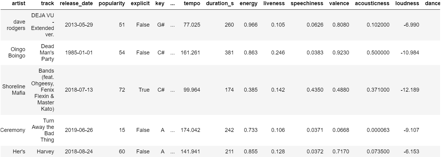
Now, I could get started on answering the question: how cool is my brand?
Popularity
Warren (2019) identified popularity as being trendy and liked by most people. To measure this, I looked at the data within the popularity and release date columns. Music that is popular contains a float value from 0 to 1, with 0 being unpopular and 1 being the most popular. Release Date is simply a date denoting when the album that the song belongs to was released. These features will help measure if my music is trendy, and generally well-liked by others. Visualization showed that the difference in popularity was clear.
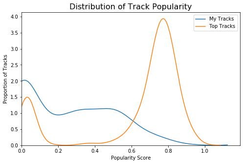
Impossible. My Tracks peak at the 0 popularity mark. On the bright side, my tracks seem to cover a good spread of popularity ranges, having decent representation all the way up to the 0.6 mark on the popularity axis.
Of course it should be expected that the Spotify Top Tracks would be comprised of songs with high popularity. Interestingly enough, we can observe a bimodal distribution for Spotify’s top track popularity through nodes peaking at both high and low popularity. This is because Spotify calculates popularity based on current Spotify listening activity. Meaning, tracks may have had a high popularity score in their heyday, but have since fallen off. This is exemplified by looking at exactly which songs fall under this category.
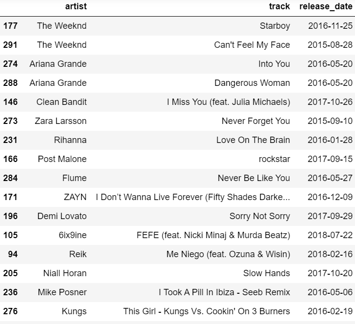
All of these were massively popular songs! Most of these songs likely came from the Spotify playlists encompassing the top songs of 2016, 2017, and 2018. Still, these songs do not make up a majority of the tracks in this dataset, indicating that truly popular songs remain popular for a while before completely falling off.

On top of this, it seems like my mode release data for low-popularity tracks is 2 years older than the top tracks on Spotify. So that was straight-forward, but with these findings, it seems like my brand is not popular. However, low popularity could be indicative of other qualities, such as being part of a subculture, or even originality (other measures of brand coolness).
Subcultural
Proving this one will require a bit more, so to get a rough idea of differences between several features at once, I chose to plot everything on a radar chart using the means of each audio feature.
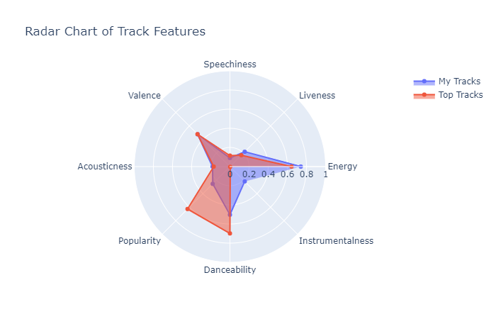
As we saw before, the largest difference seems to be within popularity, followed by instrumentalness and danceability. While the names are somewhat intuitive, instrumentalness reflects how instrumental a song is (more vocals (less instruments) -> lower instrumental score). Danceability is how danceable a song is, which is based on tempo, time signature, and other factors. Differences in these specific columns can indicate larger differences that exist within the music libraries at large. Now we can look at the differences in danceability and instrumentalness distributions.
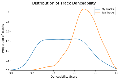
The two distributions are strikingly different and it seems like my music encompasses a wider variety of music. Most notably, top tracks seem to be poorly represented under the low danceability score region. This fact is supporting evidence that my music could potentially be more subcultural.
Now to check instrumentalness.
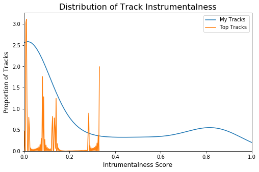
To clarify, Spotify specifies that instrumental scores over 0.5 denote songs with very little (if any) vocal. It seems like top tracks never go over an instrumental rating of ~0.3. While my music also has a prominent peak near 0, I also encompass a much larger spectrum of instrumentalness. Coupling these findings with the popualrity verdict, it seems like my music has subcultural tendencies but to be sure, more is needed. We can use K-Means clustering to identify underlying clusters within the data, and how my tracks may be divided up.
Since I’d like to include as many features as possible, it would benefit me to use Principal Component Analysis to reduce dimensionality. PCA takes advantage of the representing data in the form of vectors and a feature space. By calculating the eigenvalues, we can stretch our feature space to smaller dimensions while preserving the meaning in the data by being dependent on explained variance instead. First we must identify the optimal number of PC’s by measuring explained variance by the number of PC’s used.
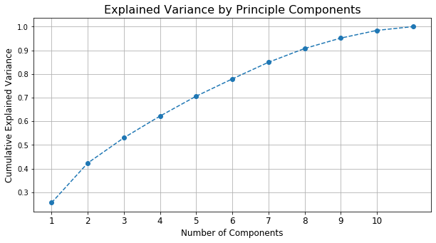
Generally speaking, 80% explained variance is a good marker to shoot for, meaning I would choose six Principle Components. But after some tinkering I found that not much information was being stored within the last two PC’s. For that reason, I will only be using four PC’s, which cover nearly 65% of explained variance within the data. To get a better idea of what’s being accounted for, we can check the loadings for each component.
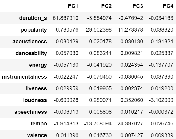
From these four PC’s, we can see that primarily variance in duration (in seconds), tempo, and popularity is being accounted for. Tempo and duration also happen to be key factors in calculating danceability, so this is alright. Interestingly enough, PC2 and PC3 seem to hold information on the same features, but inverted. This will be important to keep in mind during interpretation.
Next we can test to see how many clusters are optimal for the K-Means model using the elbow method as well as sihouette score.
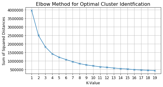
The elbow here occurs at 4 clusters. We choose the elbow because after this point, we begin to receive diminishing returns on how much error is being minimized.
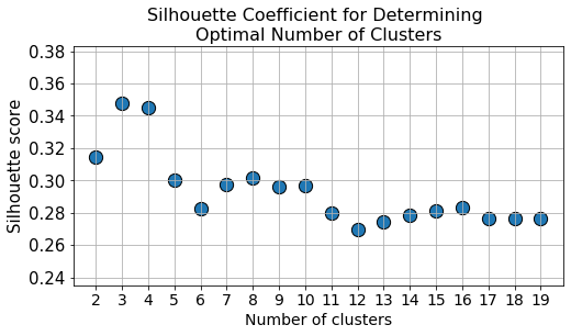
Silhouette score is a rating method that shows how well the clusters are separated at each value of k, the higher the y-value, the better the fit. This plot is in agreement with the previous plot, but also suggests three clusters might be a possibility. After some tinkering, it turns out that 4 is the optimal number of clusters for K-Means. The clusters looked like this:
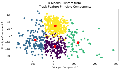
Here we see four well-represented clusters using only 2 of the 4 PC’s. While this is already suggestive of subcultures, it’s important to recall that PC2 and PC3 were basically inverses of each other. With that in mind, it would be helpful to plot this in 3-Dimensions to view a clearer picture of what’s going on!
This plot shows us that the two central clusters are acturally layered on top of each other. As these clusters have shown, there are several different groups existing within my data based on tempo, duration, and popularity alone. Given the existence of these group within my music, it is safe to say that my music is indeed subcultural. These findings also support the notion that my music taste is different enough from the population to suggest it might also original, but still more evidence is required.
Energetic
In checking the distribution for track energy, I observed that my tracks are more energetic, but only slightly.
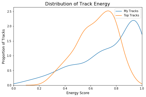
To better understand this distribution, I should check if this feature is correlated with any other variable. Another variable being linked to energy could be used as an additional feature to help us gauge overall energy.

So here we see that acousticness is negatively correlated with energy, meaning that as acousticness goes down, energy goes up! So a music library with less acoustic songs will generally be more energetic. However after visualizing, the relationship between energy and acousticness didn’t reveal much other than I had slightly less acoustic tracks, but nothing to write home about. So I moved on to loudness and energy, which had the strongest correlation.
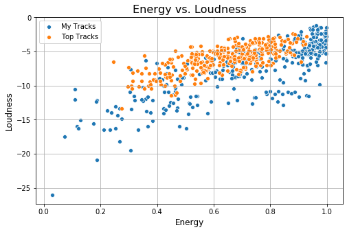
Both datasets seemed to follow a somewhat linear relationship. Since my data and the top Spotify tracks were neck-and-neck in their energy distribution, we can benefit a lot from trying to predict who ultimately would have come out on top. Given the trend seen between energy and loudness, it seems that our data is a great candidate for linear regression. From there we could predict who’s music will get more energetic as tracks got louder. One thing to look out for is the smaller group that runs beneath the main cluster for my tracks. This group seems to follow the same increasing relationship, but for quiet tracks that are high energy (a group that doesn’t exist in the top spotify tracks). The following models were produced:
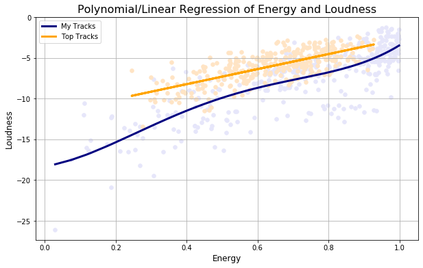
A polynomial regression improved performance for modeling my tracks, but a linear model seemed to work best for the top Spotify tracks. While it seems like my tracks could be predicted to be more energetic, the models performed rather poorly. Thus, it would be hard to say which group would come out on top with complete confidence. So in order to answer this question, we needed to look at it from a different angle, namely, enthusiasm. Enthusiasm is a key component to energy in brand coolness, along with vigor and raw energy (which we’ve just tested for). To measure enthusiasm and vigor, I would go on to scrape lyrics off of Genius and analyze sentiment using VADER to study polarity scores present within my music. How I was able to integrate Spotify and Genius to get song lyrics is showcased in the Lyric Scraping notebook.
A few regular expressions later and now we were ready to analyze lyrics. VADER is a lexicon used to analyze common speech observed on social media sites such as facebook and twitter. A great strength of this method is how sensitive this lexicon is to the context in which words appear in, so I thought it perfect for analyzing lyrics as well. Sentiment analysis returns scores between 0 and 1 for the proportion of negative, neutral, and positive sentiment words pressent in the document. VADER also returns a compound score denoting the overall sentiment present within the text. Compound score is an aggregated value between -1 and 1 that denotes the overall sentiment of the document (in this case, lyrics).
For example, “Boasty” by Wiley scores a 0.97 compound score, classifying it as overwhelmingly positive. While it’s an upbeat song, it isn’t necessarily talking about sunny days and picnics. Instead, it is focused on confidence, success, and just being proud of your accomplishments! Still, VADER was able to detect this and classify the song accordingly. Another song such as “Deja Vu” by Dave Rodgers scores a -0.63 compound score. This classifies it as moderately negative. Similar to “Boasty”, this song isn’t necessarily negative in the sense that it is sad or angry. Instead, “Deja Vu” describes a mysterious individual facing some for of conflict, which VADER detects and grades perfectly. Back to my songs!
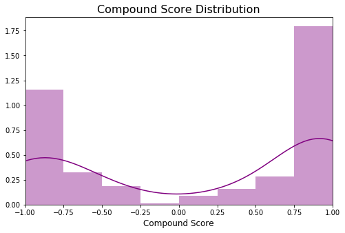
This plot shows that my scores tend to be either extremely positive or extremely negative in sentiment. Given how polarized my lyrics seem to be, it seems as though enthusiasm is a strong component to the music I like. On top of this, there are very few tracks with neutral (un-enthusiastic) polarity scores. To ensure these compound scores have a relationship with energy, I checked for correlation. The following plot showcases this relationship and uses DBSCAN to identify the specific groups that exist within this relationship.
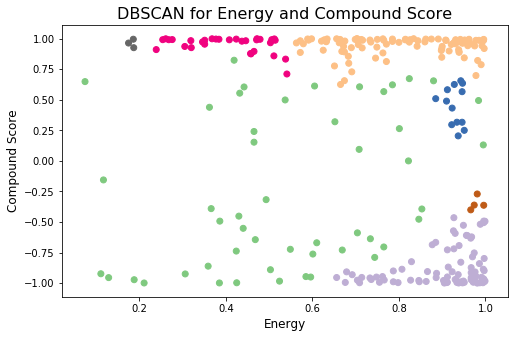
From this we could see that energetic music seems to cluster around very positive and very negative sentiment more than anywhere else. Such an implication confirms the notion that my music is enthusiastic, and that enthusiastic music can be associated with energy. After all, what would high energy music with neutral sentiment even sound like?

Apparently it would sound like “Entropy: No Meaning Is Also An Answer” by Ceremony. Ceremony is one of my favorite bands, their genre of music is called “Power Violence”, which is basically short songs with a ton of energy. The lyrics seems sort of neutral, given the name of the song I’m assuming that’s intentional.
Anyway, all of this combined proves my music is energetic, making my brand cooler! Moving along:
Rebellious and High-Status
Now that we had lyric data, we had a solid way of testing for rebellious and high-status themes. Wikipedia states that rebellions have sprung as a result of “Political Violence, Class Struggle, State Autonomy, and Societal Values”. So we operationalized rebellious themes as ideas surrounding change, conflict, and leaders. High-Status is conceptualized as something associated with social class, prestige, and sophistication. Almost perfect opposites! But this gives us a great intuition to how brand coolness develops. The coolest brands such as Nike have been at the forefront of coolness for years, partially because they were able to find balance between being rebellious, and high status. Any brand (or individual) that can embody this model is without a doubt: cool.
To understand if these themes existed within my music, I used Latent Dirichlet Allocation to model topics. LDA is an method that generates a user-specified number of topics and works backwards to figure out the probability that a given word belongs to a topic, and the probability that a given topic is found in a document. The model repeats this process in a bayesian manner until it converges, producing topics that describe the text within the entire dataset. For the model to work properly, standard text preprocessing was performed. The resulting model produced the follwoing topics:
- Topic 0: life know got day youll dont young proud try world
- Topic 1: dont know night going gonna got cause right freedom good
- Topic 2: know tell aint said ride got didnt brothers girl house
- Topic 3: line man yeah youve woman body got money boy theres
- Topic 4: really got dont love come pieces know whoa want baby
- Topic 5: time mind sick feel thing come eyes fall waiting black
- Topic 6: yeah rain think fun away way feel far hollywood cause
- Topic 7: make time wanna gotta dont want got love cause stop
- Topic 8: love dont know baby want heart little need make wanna
- Topic 9: way outside away burn gonna stay say got ll change
The topics were distributed within the dataset as follows:
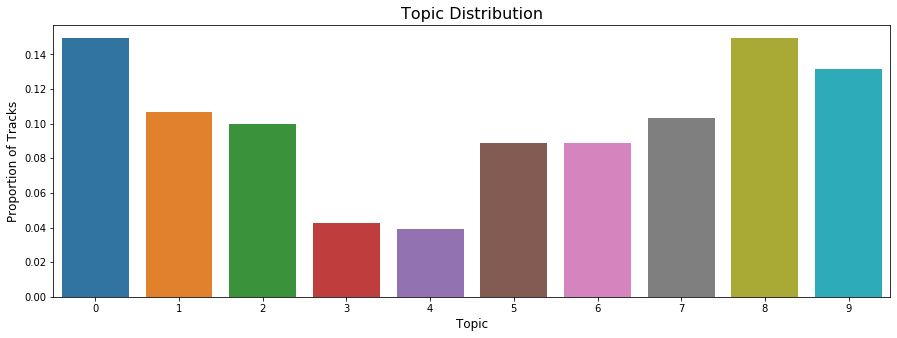
Topic 0: life day dont young try proud world
This topic is pretty abstract but it seems to encompass generally positive themes of pride, youth, and life. Though the presence of “dont” could change the meaning depending on the context it appears in. The focus focus of this topic could potentially be associated with esteem/status, but many other things as well.
Topic 1: dont know going gonna cause right freedom good
In this set of words, we find strong themes of both action words, as well as descriptors. Going, gonna, and and cause all imply an imminent action. Right, freedom, and good could refer to many things, but under this context, we can potentially say this topic is about doing the right thing, what is good, or what will bring freedom. However, the presence of “dont” and “know” could mean that there is some sort of conflict in deciding if what is being done is right. This topic could possibly be associated with revolution/conflict.
Topic 8: love dont know baby want heart little need make wanna
Topic 8 seems to cover themes surrounding love (love, heart) and desire (want, wanna, need). I believe in this context, baby refers to the use seen in relationships, rather than a literal baby.
Topic 9: way outside away burn gonna stay change
Here we see some words that hint towards rebellious themes such as burn and change, but this is still rather vague. More than anything, words such as way, away, outside, and stay indicate some form of changing location. Paired with that, burn, gonna and change could refer to leaving something behind in this context, as they are all actionable words.
Overall Topic Interpretation
Topic 1 and Topic 9 both seem to share themes surrounding change, the right cause, and leaving things behind. Combined, these topics make up about 23% of my tracks. The themes present in these topics are suggestive of rebellion and fighting for what is right. Topic 0 and Topic 8 seemed to be more general positive themes that aren’t necessarily related to rebellion or status. The only themes that remotely mention status are Topics 3 and 6, which mention “got, money” and “hollywood” respectively. Well I’ve never been to Hollywood and I know for a fact I don’t have any money so we can rule those out. Also because Topic 3 only represents less than 4% of my tracks and Topic 6 is still very vague.
So it seems like rebellious (but not high-status) themes are present within my music.
Conclusion
Overall, we have identified that my music differs from the top Spotify tracks in several different ways. Not only in the sense that it’s subcultural, but the amount of anomalies detected indicate that my music taste is original (another measure of cool). With all this in mind, we have found that:
My brand IS:
- Subcultural
- Energetic
- Rebellious
- Original
My brand IS NOT:
- Popular
- High-Status
Untested Metrics:
- Iconic
- Extraordinary/Useful
- Authentic
- Aesthetically Appealing
In order to improve my coolness, I should seek to listen to more music that is associated with high status themes. Spotify offers several playlists that encompass high-society, confidence, and even space-themed classical music. These three playlists will help fill the gaps within my music library and hopefully at the end of it all I will come out as a high-status individual! On top of this, I should incorporate more popular and trendy songs into my playlists.
BUT if I did all of that then I wouldn’t be true to myself, I wouldn’t be Dav Corp.. That being said, while I recognize my shortcomings, I ultimately opt to be more authentic in my listening than anything else. If the reader will allow it…… I’d like to award myself a point for authenticity as well………:
My brand IS ALSO:
- Authentic
That’s a solid 5/7! As for the other metrics, I believe they aren’t really answerable with this dataset. These are characteristics that I will likely revisit in the future! Regardless, I will strive to be iconic, extraordinary, and aesthetically appealing.